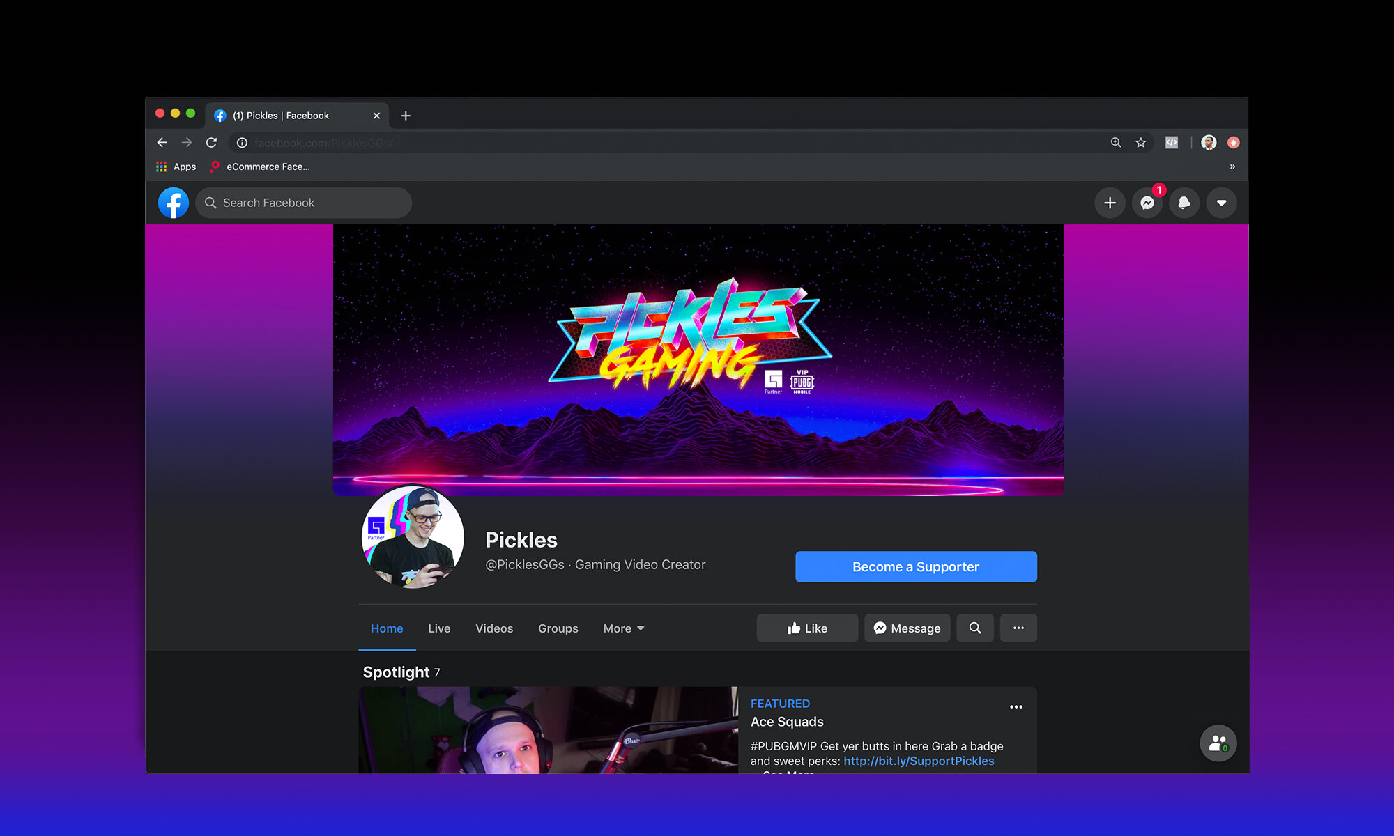
Pickles the PUBG Prodigy
With 550K Facebook followers and a global reach of 5 million weekly, PUBG Mobile partner and arena prodigy PICKLES would need a logo that brought both nostalgia and excitement to each and every person who crossed his path, or more modernly, who liked his ‘page’.
The first step is to define Pickles Gaming's brand. It should be built around classic arcade themes, nostalgia, and a passion for gaming. Pickles Gaming's brand identity should represent the gamer's personality and gaming style, while also appealing to their target audience.
The Arcade effect!
The color scheme should be chosen to reflect the brand's identity. Colors like black, neon blue, and purple are commonly associated with classic arcade themes. The colors should also be used consistently across all branding materials, including the logo, overlays, and social media profiles.
PICKLES XIII GAMING
Pickles, has been PUBG/Shooting prodigy for years now, and his numbers show it. While most of the Gaming community generated content has herded into Twitch and Youtube, Pickles found his home and built a legacy on Facebook. Pickles Gaming needed a logo update that kept its energy similar to the roots of his night rider/underground arcade theme, but would give it a facelift that would separate it from his competitors. We battled through a variety of fonts, until ultimately creating our own video game inspired type. Mixing that with 3d elements and bit of TRON flair, and well we’re ready to go LIVE.
For more information on PICKLES visit: https://www.facebook.com/PicklesGGs/?ref=page_internal


